Zitat

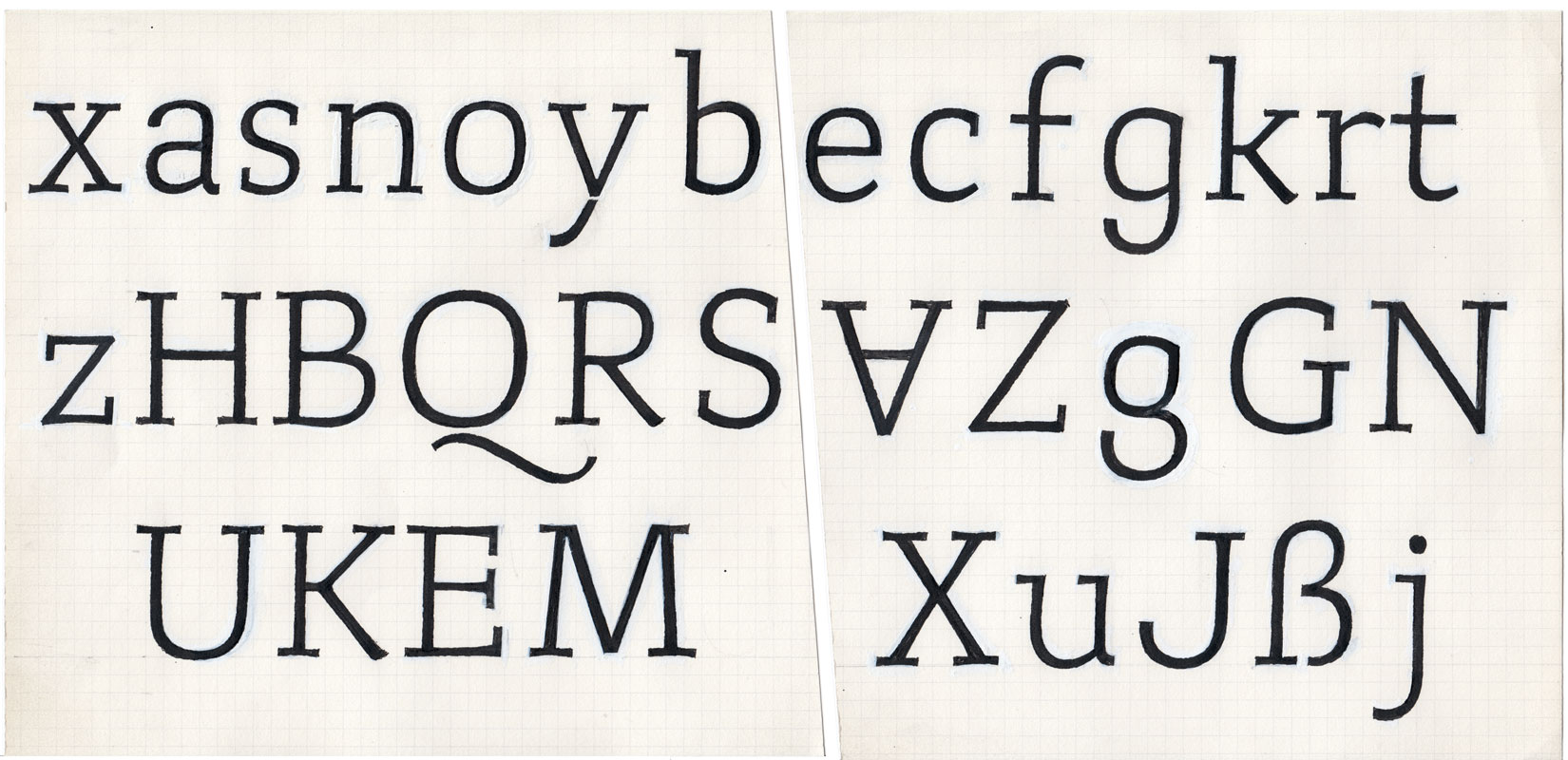
Zitat is an extremely legible typeface originally designed for use in newspapers. Clarity is the supreme design principle: complex letter forms, which would lead to blobbing in small sizes, are opened (seen in B, K, R, g, k). Unnecessary serifs are removed (for example at E and F). The lower case characters h, m and n have semi-serifs – leaving the inner spaces of these letters more open. The capitals are slightly bolder than the lower case characters to help structure the linguistic rhythm.

The italic is a beautiful typeface in its own right. The variety of angles give it a lively and vibrant character. The only true serif in the lower case can be found in the »f«, to avoid a descender, which would have looked too calligraphic. The only direct reference to writing is in the lower bar of the z.

Zitat contains Old-style figures by default. Lining figures and Tabular figures are also available.
Early drawing of Zitat, 1995