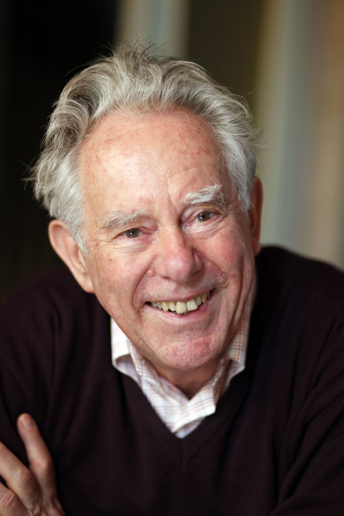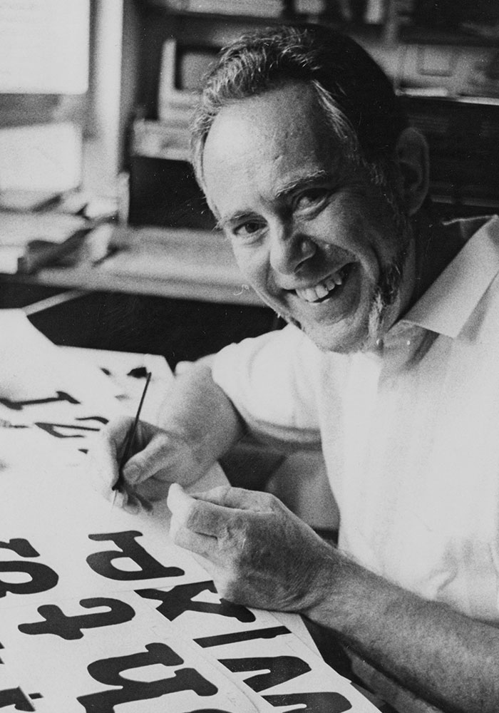
Georg Salden, Image: Georg Valerius
TypeManufactur distributes exclusively the typefaces by renowned type designer Georg Salden. With a storied career spanning over 50 years and hundreds of original fonts that speak to the aesthetics of an era, type designer Georg Salden is one of the most significant and diverse type designers of our time. Despite much of his work having a lasting influence on type culture, Salden remains relatively unknown internationally – a fact which may be due to his independence as a designer, never having worked for large font foundries. For Salden, legibility is a typeface’s primary design principle. He makes great demands of his designs: “Typefaces should not be the realization of a crazy design idea, but able to be used for many tasks. Typefaces with characteristics that don’t seem tired after a few weeks of use, which are functional, create nice word images, and have a certain technical robustness. They must possess all the good qualities which good metal typefaces have excelled at through the centuries, but generally make use of the greater freedom of the new techniques.” To Salden, expressiveness and legibility aren’t opposed – in fact, quite the contrary. His typefaces have personality, telling a unique and clear story regardless of the text’s content. Salden says, “One should not try to make typefaces expressive. You shouldn’t have to think about it. It’s like a walk, where you go here or there because you imagine it may be beautiful.”
Since 2008 Georg Salden collaborates with Ludwig Übele to make his extensive font library available digitally and exclusively at TypeManufactur. Übele is himself a passionate type designer, his type designs are available at LudwigType.
TypeManufactur
Blumenthal 1
86551 Aichach
Germany
Phone +49 (0) 1773723738
mail@typemanufactur.com

The quiet revolutionary
Georg Salden has been designing typefaces for over 50 years. He is sometimes described as a conservative type designer, and has no objection to this term. He himself says that he sees his typefaces as a continuation of earlier, high-quality hot metal typefaces, that their broad usability serves as a benchmark for him and that he finds the comparison stimulating. But that is as far as it goes. His typefaces are designed in accordance with his own aesthetic and functional principles. The idea of borrowing from other people’s designs, even earlier designers, is abhorrent to him. As far as he is concerned, designing a typeface is a highly personal creation of images, which need to retain the archetypal form they have acquired over the course of centuries. Salden refers to this as the formation of reading tools, and along with a sense of style, this demands a capacity for logical and practical thinking.
Georg Salden was born in Essen in 1930. He discovered his fascination with the art of writing as a twelve year old, when he was inspired by the work of his uncle, the bookmaker Helmut Salden, who had emigrated to the Netherlands. Right after he graduated from the Folkwang school in Essen he opened a commercial art studio and became self-employed. From 1972 onwards, he concentrated entirely on type design. Financial security came with the foundation of the GST group. For the typesetters in this group Salden designed a number of exclusive types, at first primarily for the Staromat typesetting machine, and later for the Diatronic from the Berthold type foundry.
Since 1972 Georg Salden has designed around forty typeface families with more than 500 fonts. While each of them has a character of its own, good legibility is always of primary importance. “Type design is a job where there is no room for easy solutions. Letters can perhaps be designed quickly using a compass and ruler, but these are unsuitable for a typeface, as they fail to satisfy the subtle optical laws that make reading enjoyable.” In our fast-moving times, Salden advocates slowness, patience and manual labour, especially when designing types. “You cannot acquire experience by working with a computer, but rather with a pen, with paint and brush, with the hands and with much effort. Only then can the New arise in your head.” That’s not to say that Georg Salden underestimates the benefits of the computer. It’s just that “it cannot produce creative, high-quality reading alphabets. The progress of our culture of the written word should not be halted by a power cut.”
Herbert Lechner once described Georg Salden as “the quiet revolutionary”. He is pleased with that, because silence is essential to creativity, and revolution is a form of attentiveness to life.