Turbo

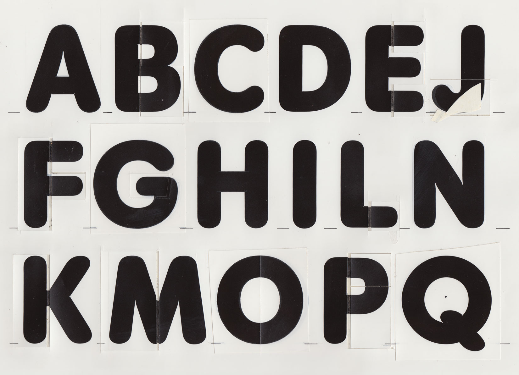
Photographic reproduction of the hand-drawn characters, which served as template for phototypesetting films. Turbo follows the classical Roman proportions, which means that the ‘O’ and related characters are based on a circle.

Original drawing from 1974. The typeface was first called Futuranea and came in 18 styles and weights. Later Georg Salden revised the type family and changed the name to Turbo.
Special attention has been given to the stem-endings. They are not mechanical semi-circles rather, in all the various positions, they are manually shaped so that their curves make sense from a design perspective. Thanks to tiny factors like this, they form a closed base line.
