Deutschkurrent
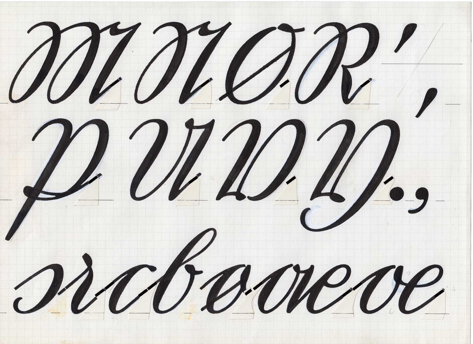
Commonly known as Old German Script, Kurrent is the most popular handwriting style found in nonrepresentative handwritten German documents from the 16th through middle 20th centuries. It originally evolved from the Gothic cursive handwriting at the end of the Middle Ages. Georg Salden started, at the age of 5, in school with a certain late variation of the script, called Sütterlin. He studied the originals of Deutsche Kurrentschrift at the academy and wrote first sketches for the digital font with a pointed flexible metal pen. His Deutschkurrent is comparatively easy to read, because it avoids all superfluousness and decoration.
In contrast to the ‘round’ Latin letters the Kurrentschrift is characterised by straight strokes, very sharp angles and egg-shaped curves, often tied by a small loop. The German language has all 26 letters as used in the English alphabet, plus a few additional letters: umlauted vowels – ä, ö, and ü – and an Eszett, ß. It should also be noted that the lowercase letter ‘s’ has two different forms depending on its context. The long ‘s’ appears at the beginning of a syllable, the round ‘s’ at the end of a syllable. For German words the font Deutschkurrent Expert chooses the right form of ‘s’ automatically by utilising very sophisticated OpenType features. You can also type the different ‘s’ by hand on your keyboard: The standard ‘s’ is always the long ‘s’. To get the round ‘s’ please use the number sign. For Deutschkurrent Expert the long ‘s’ is also placed on the asterisk sign (In case you wish to correct on the automatic ‘s’ replacement.)
For most people outside of Germany, as well as younger Germans, the Kurrentschrift is nearly illegible – perhaps even more so than Fraktur printing. Using the font Deutschkurrent one can typeset the document digitally to keep the general look of the writing whilst making the text copyable (to switch the font into a readable Latin font). Since the font contains also the appropriate Latin glpyhs (see image above), one can even type the document in readable letters while keeping the distinctive appearance of the writing.

Drawings of Deutschkurrent made by hand by Georg Salden.


