Daphne

Daphne Basic contains no swashes or alternate glyphs. The terminals of ascenders and descenders are smooth.
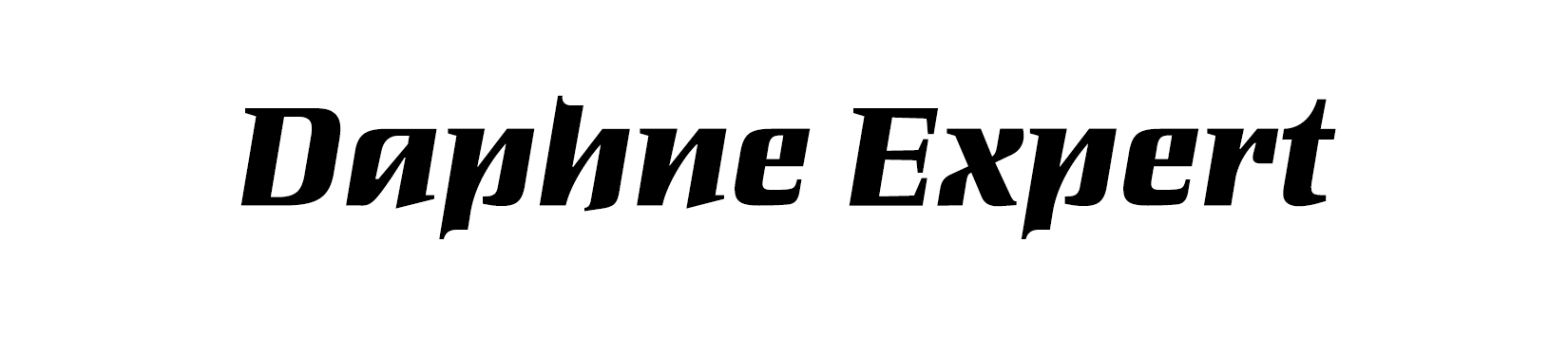
Daphne Expert contains numerous calligraphic swashes, which can be added to the particular base glyph using OpenType feature. Therefore ascenders and descenders are specially formed. Alternate glyphs and complete swash letters supplement the character set. See a complete overview of the included OpenType features download the Daphne User Guide PDF (PDF, 188KB).
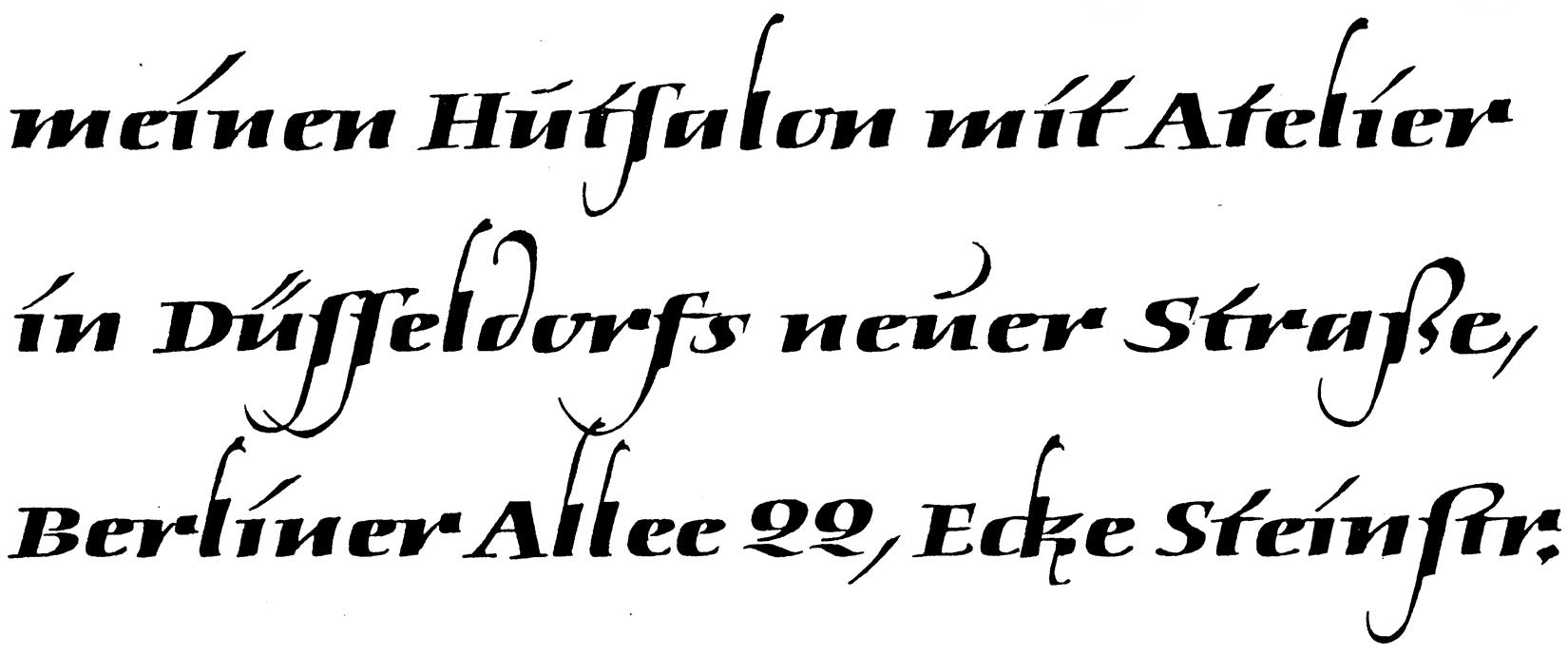
This written text (top) served as the basis for »Daphne«. Georg Salden writes:
I was asked take on a contract for a hat shop in Dusseldorf in the 1960s. As an opening advert I used a text written with the broad nib pen which turned out to be the basis for »Daphne«. It was all about the bold italic line with large swashes. This font was accepted by Berthold for its Staromat. The various swashes could be copied onto other letters, depending on taste. This provided hundreds of possibilities. Although I gave exact instructions as to how these swashes were to be used, the production placed them wrong, some even upside down. This was one of the reasons why I decided to publish my fonts independently.
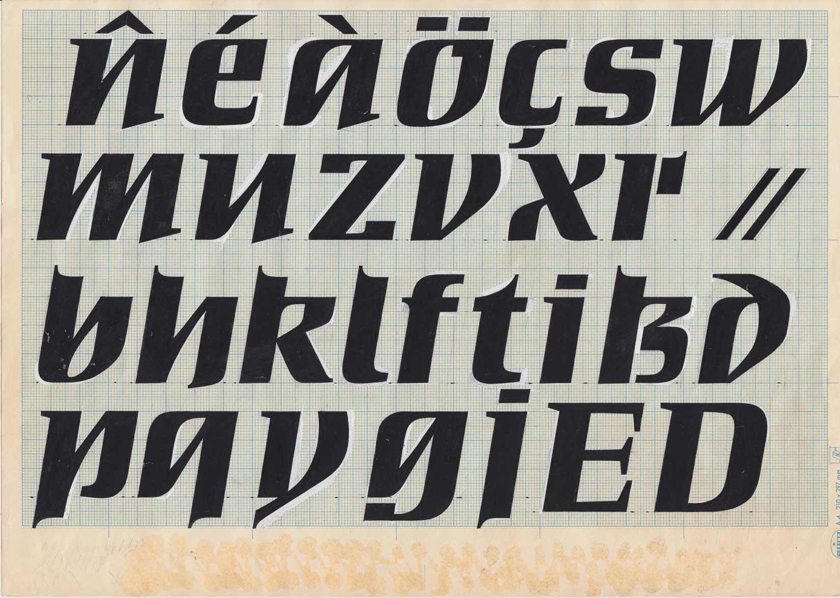
Original drawings for photosetting.